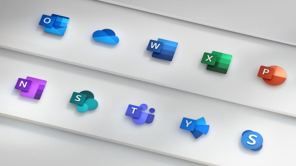
Microsoft back in 2013 has updated the Office icons and after five years, the company is again transforming office into a collaborative suite that lets you work together in real-time from almost any device. The company is changing the official icons for Office 365 again. https://www.youtube.com/watch?v=YplAU5myNP4 The company says that it has used gestalt principles to further emphasize key product changes. While each icon has a unique and identifiable symbol, there are connections within each app’s symbol and the collective suite. The company has removed a visual boundary: the traditional tool formatting. Whereas prior Office icons had a document outline for Microsoft Word and a spreadsheet outline for Excel, it now shows lines of text for Word and individual cells for Excel. These icons embody the collaborative nature of the apps they represent. It also changed the letter-to-symbol ratio. Traditionally, the letter occupied two-thirds of the icon, and the symbol took up one-third. It has changed this ratio to now emphasize the symbol because while the letter represents the tool itself. The new icons will begin rolling out across platforms in the coming months, starting with mobile and web. Source
 Read Here»
Post a Comment Blogger Facebook
We welcome comments that add value to the discussion. We attempt to block comments that use offensive language or appear to be spam, and our editors frequently review the comments to ensure they are appropriate. As the comments are written and submitted by visitors of The Sheen Blog, they in no way represent the opinion of The Sheen Blog. Let's work together to keep the conversation civil.