
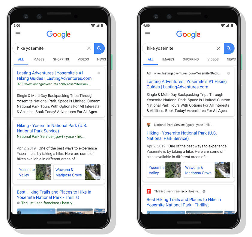
 Google is introducing a new design for Search on mobile replacing the old design which showed the Title of the Search Result first followed by the URL. In this new design, Google is placing the website’s branding on front and center to help users better guide through the information available on the web. The new design change is subtle with the website's branding on front and center. Google says that the new design will help users better understand where the information is coming from and what pages they are looking for. Earlier, the Search Results which were blue in color showed up first, followed by the publisher's website in a smaller green colored font. With the revamped design, the publisher's website URL shows first along with a small icon, followed by the Search Results. This will be a boost to publishers as it gives them a way to stand out. The revamped design also brings changes to Google Search Ads and how they appeared. In the previous design, the word "Ad" would display in a green text box placed below the Search Result. Now, the green colored box is gone and the word ''Ad" would display in a bold, black font where the website's ...
Read Here»
Post a Comment Blogger Facebook
We welcome comments that add value to the discussion. We attempt to block comments that use offensive language or appear to be spam, and our editors frequently review the comments to ensure they are appropriate. As the comments are written and submitted by visitors of The Sheen Blog, they in no way represent the opinion of The Sheen Blog. Let's work together to keep the conversation civil.