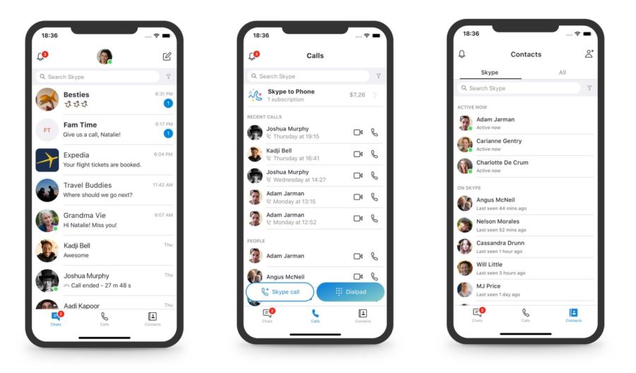
 Redmond-giant is all set to redesign the Skype app in an attempt to give overall better experience for the users. In a push towards simplicity and familiarity as claimed by the company, they are removing the Highlights and Capture features, leaving the remaining Chats, Calls, and Contacts. As per the company, provides a cleaner and more efficient user interface (UI) that is easy to navigate while still providing all the functionality Skype customers want. It's worth mentioning here that Microsoft introduced ‘Highlights’ feature in Skype for iOS a year ago. Having said that, Skype on the desktop also received some tweaking, where buttons for Chats, Calls, Contacts, and Notifications have been moved to the top left of the window. Moreover, the company has also introduced light and dark themes. In addition to that, they have reintroduced a simplified Skype “Classic” blue theme—adjusted for contrast and readability. Furthermore, to simplify things, they've reduced some of the more decorative elements—such as notifications with a squiggle shape cut out as well. These changes came as a result of extensive testing across global markets and building prototypes to test new concepts. The new design is available in the latest Skype version (8.29) for Android, iOS, OS X, Linux, Windows ...
Read Here»

Post a Comment Blogger Facebook
We welcome comments that add value to the discussion. We attempt to block comments that use offensive language or appear to be spam, and our editors frequently review the comments to ensure they are appropriate. As the comments are written and submitted by visitors of The Sheen Blog, they in no way represent the opinion of The Sheen Blog. Let's work together to keep the conversation civil.