

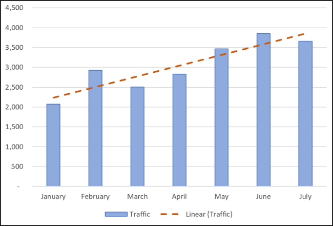
You can add a trendline to a chart in Excel to show the general pattern of data over time. You can also extend trendlines to forecast future data. Excel makes it easy to do all of this.
A trendline (or line of best fit) is a straight or curved line which visualizes the general direction of the values. They’re typically used to show a trend over time.
In this article, we’ll cover how to add different trendlines, format them, and extend them for future data.
Add a Trendline
You can add a trendline to an Excel chart in just a few clicks. Let’s add a trendline to a line graph.
Select the chart, click the “Chart Elements” button, and then click the “Trendline” checkbox.
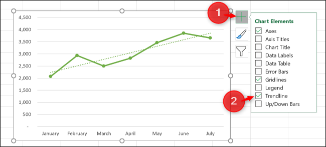
This adds the default Linear trendline to the chart.
Post a Comment Blogger Facebook
We welcome comments that add value to the discussion. We attempt to block comments that use offensive language or appear to be spam, and our editors frequently review the comments to ensure they are appropriate. As the comments are written and submitted by visitors of The Sheen Blog, they in no way represent the opinion of The Sheen Blog. Let's work together to keep the conversation civil.