

A combo chart in Excel displays two chart types (such as column and line) on the same chart. They are used to show different types of information on a single chart, such as actuals against a target.
In this article, we’ll demonstrate how to make a combo chart that follows the same axis and one that displays mixed types of data in a single chart on a different axis.
Insert a Combo Chart with a Single Axis
In the first example, we will create a combo chart to show monthly revenue against a target using the sample data below.

You can see that the target value is the same each month. The result will show the data as a straight line.
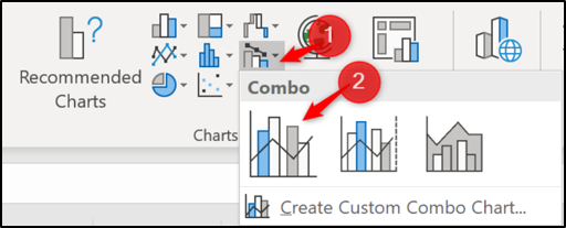
To get started, select the range of cells you want to chart—A1:C13 in this example. Next, click Insert > Insert Combo Chart. Select “Clustered Column – Line.”
The combo chart is inserted with both the column and line using the same axis. Easy as that!
Post a Comment Blogger Facebook
We welcome comments that add value to the discussion. We attempt to block comments that use offensive language or appear to be spam, and our editors frequently review the comments to ensure they are appropriate. As the comments are written and submitted by visitors of The Sheen Blog, they in no way represent the opinion of The Sheen Blog. Let's work together to keep the conversation civil.