

Google Sheets lets you generate charts automatically to create a visually appealing way to convey information. Using charts is a great way to help people retain data a lot easier than looking at a bunch of numbers.
Google Sheets gives you a wide variety of free graphs from which to choose. Whether you want to use a pie chart or something a little more complicated like a radar chart, you won’t be disappointed with the options available.
The first thing you need to do is fire up your Google Sheets homepage and open a new or existing spreadsheet.
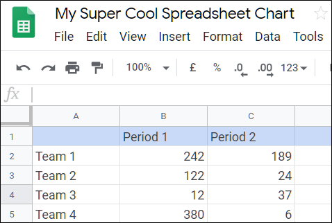
If you just opened a new spreadsheet, now would be a good time to insert some data into the cells. After that, click “Insert” and then “Chart.”

From the drop-down list, click the type of chart you want to add. In this example, we are going to use a smooth line chart, but you can choose from 30 different types of charts.

Post a Comment Blogger Facebook
We welcome comments that add value to the discussion. We attempt to block comments that use offensive language or appear to be spam, and our editors frequently review the comments to ensure they are appropriate. As the comments are written and submitted by visitors of The Sheen Blog, they in no way represent the opinion of The Sheen Blog. Let's work together to keep the conversation civil.