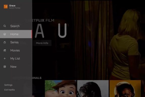
 Netflix today introduced a brand new for TV experience and this new design is based on how the company can make it easier to find relevant content on TVs, focusing majorly on where the navigation is tougher when you are left with few buttons on a remote control. The new TV interface now makes it easier to search and view new content added to the service. Browsing is now is less complex with either TV series or movies since users are not always sure of what to watch next. It also made it easier to access titles you’ve saved for later viewing in My List. Netflix says that this new design during testing, helped members find something great to watch. Netflix said that it will be rolling many improvements out over the coming months to make the platform even better for user around the world. The new TV experience will begin rolling out to everyone all over the world starting today. Stephen Garcia, Director, Product Innovation in a blog post said: Along those lines, we will continuously learn from our members and evolve the TV experience so that it gets even more simple, fun and easy to find the stories that make Netflix great. Much like how ...
Read Here»

Post a Comment Blogger Facebook
We welcome comments that add value to the discussion. We attempt to block comments that use offensive language or appear to be spam, and our editors frequently review the comments to ensure they are appropriate. As the comments are written and submitted by visitors of The Sheen Blog, they in no way represent the opinion of The Sheen Blog. Let's work together to keep the conversation civil.