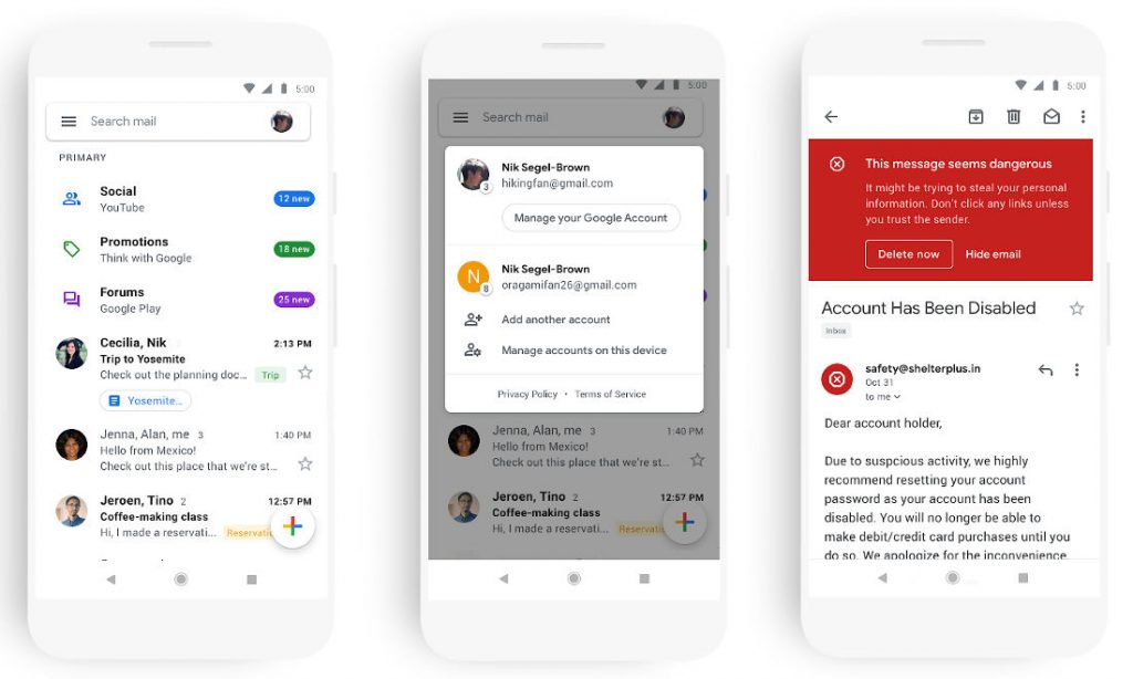
 Quite lately, Google has been revamping its entire set of products in an attempt to optimise and suite the latest trend. The search engine giant has recently made some notable changes in GDrive and Docs, Sheets, Slides, and Sites on the web. In the latest development, Google is bringing a new look to Gmail on mobile space, after rolling these to the Gmail web. According to the company, with new designs, you can quickly view attachments—like photos— without opening or scrolling through the conversation. Moreover, they have made it easier to switch between the accounts, in order to access emails without breaking a sweat. Secondarily, they have replaced the search button with a search bar at the screen top. Just like the web, users will get similar red warnings as an alert when something looks like a threat. With machine learning, Gmail can assist you to draft emails faster using Smart Compose, or reply to messages quicker with suggested responses generated by Smart Reply. It can also “nudge” you to follow up on emails with subtle reminders in your inbox and notify you to reply to threads so that you can prioritize what’s important or overdue. This update is part of a larger effort to bring the look and feel of G Suite apps together as a whole, and always with ease-of-use in mind. The company also stated, "In the coming weeks, you’ll see the new mobile design in Gmail on Android and iOS, with more G Suite mobile apps to follow later this year." Source
Read Here»

Post a Comment Blogger Facebook
We welcome comments that add value to the discussion. We attempt to block comments that use offensive language or appear to be spam, and our editors frequently review the comments to ensure they are appropriate. As the comments are written and submitted by visitors of The Sheen Blog, they in no way represent the opinion of The Sheen Blog. Let's work together to keep the conversation civil.