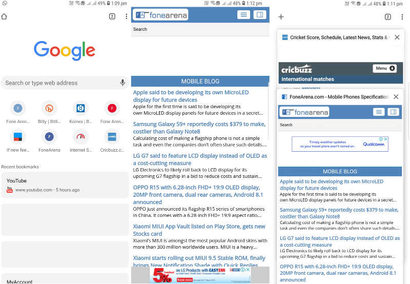
 Google is now rolling out Chrome 66 beta for Android which brings some new and experimental features on the table like the 'Modern Design' interface, updated to the media player and a new Clipboard API. Though Google did test the new Chrome Home U.I for a while which is expected to replace the age-old design of browser, it was canceled at the last minute. Now, Google is introducing a new 'Modern Design UI' with more rounded edges, and it looks like this U.I will be retained as the flags #enable-chrome-modern-design is available in this release. The new interface looks a lot like the Chrome Home, except for the address bar which was previously present at the bottom. The New Tab Page has a white background with light gray elements, and the icons for frequently-visited sites are smaller. The tab switcher has a white background, and the tab button is slightly rounded. The status bar is no longer dark and matches the color of the site you are viewing. Furthermore, the new design change also bought a new improved video player which now has the play/pause button in the center, and the remaining controls moved to above the timeline, and now you can just double tap on the ...
Read Here»

Post a Comment Blogger Facebook
We welcome comments that add value to the discussion. We attempt to block comments that use offensive language or appear to be spam, and our editors frequently review the comments to ensure they are appropriate. As the comments are written and submitted by visitors of The Sheen Blog, they in no way represent the opinion of The Sheen Blog. Let's work together to keep the conversation civil.